


Understanding Civil point leader and components in dragged state
Overview
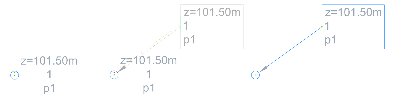
Civil points contain two grips. The primary grip is placed at the insertion point, while the alternative grip is placed vertically above the insertion point and it is always attached to Label style. You can use the alternative grip to drag the point label away from the insertion point and to create a Leader.
Civil point leader style is defined inside Label Styles and can be edited in the Dragged state tab in Label Style Editor dialog box. The Label Style Editor dialog box can be opened from the Settings tab of the Civil Explorer panel.
Dragged state settings
In the Label Style Editor dialog box, you can define the style of the leader and label components when they are in a dragged state by navigating to the Dragged State tab.
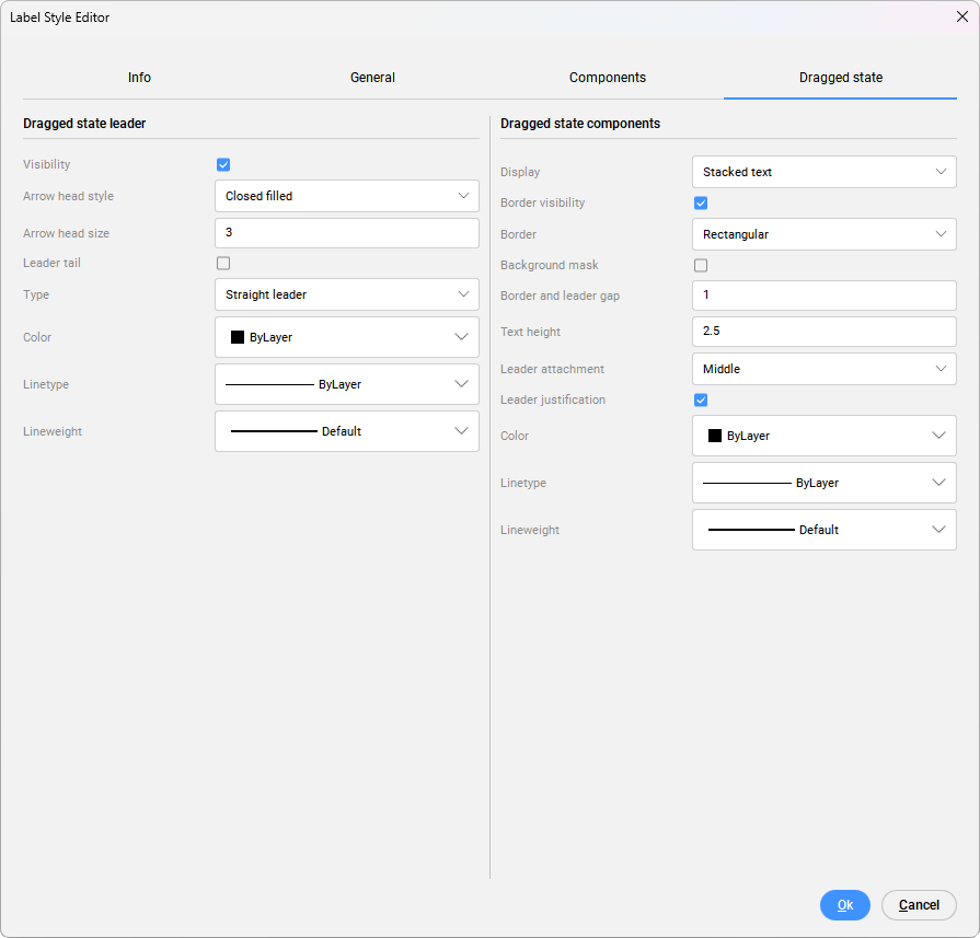
- Dragged state leader
-
The visibility of the leader can be toggled ON or OFF. You can choose between different types of arrow heads, that can be selected from the Arrow head style drop-down list. The arrow head size can be defined in the Arrow head size field. The Leader tail can also be toggled ON or OFF. When the leader tail is turned on, its length is equal to the arrow head size.
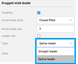
You can define the leader type as either a straight line or a spline. To create a spline curve, change the leader type on the Dragged state tab in the Label Style Editor dialog box to: Spline Leader.
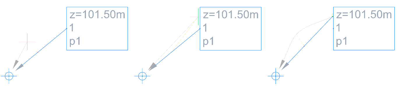
Then click on the + sign in the middle of the leader and drag its end to the desired endpoint. Selecting and dragging the + sections of the leader will create curves, while selecting - will remove sections of the spline curve.
The color of the leader can be selected from a Color drop-down list. Linetype of the leader can be defined by layer, by block or from the list of linetype styles. The lineweight can be defined from the Lineweight drop-down list.
Note: All the changes are dynamically displayed in the drawing.
- Dragged state components
-
Dragged state components can be displayed as Stacked text or As composed.
When components are displayed as Stacked text, it means their style will be defined under a Dragged State tab. When they are displayed As composed, it means the style is the same as it is defined under the Components tab. If you want the label style to be different in dragged state, select Display option Stacked text and define the rest of its properties.
Border visibility can be toggled ON or OFF. You can choose between three different Border shapes: Rectangular, Rounded rectangular or Circle. To improve the visibility of the label, you can turn on the Background mask. The border and leader gap of the label can be defined in the Border and leader gap field. The text height is defined in Text height field.
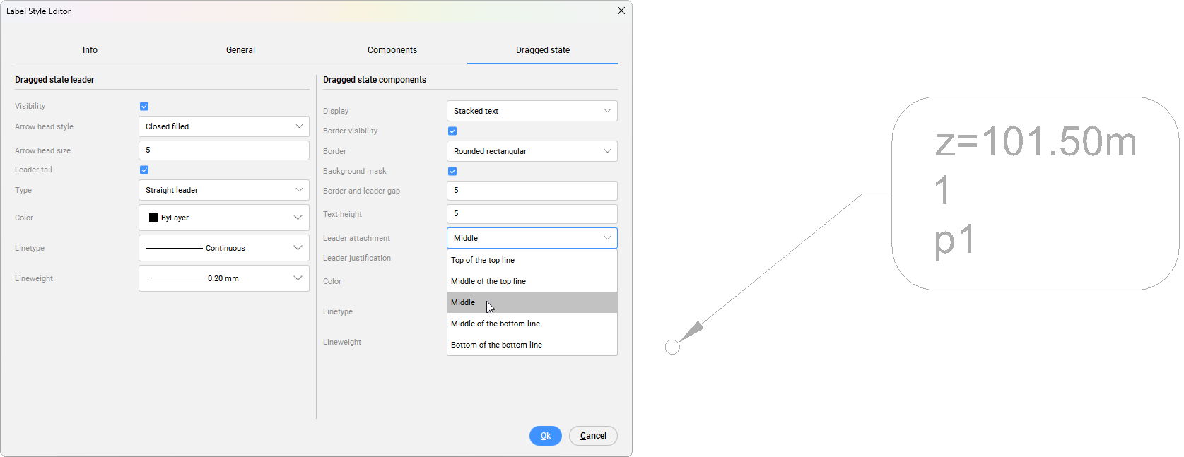
The position of the label components is based on the Leader attachment parameter. To change the position of attachment, select one of the options form a drop-down list of Leader attachment position Toggle Leader justification to change components alignment with the movement of the leader. The color of the components and the border can be selected from a Color drop-down list. Linetype of the border can be defined by layer, by block or from the list of linetype styles. The lineweight of the border can be defined from the Lineweight drop-down list.
Note: All the changes are dynamically displayed in the drawing.