Opens via: Civil Explorer panel > Settings tab > context menu of a Section View Style > Create option
The Section View Style dialog box allows you to define how a section view is displayed in a drawing.
- Info tab
- Settings tab
- Labels tab
- Horizontal axis tab
- Vertical axis tab
- Display tab
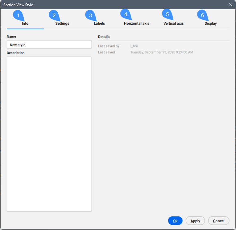
Info tab
Displays information about the section view style.
- Name
- Sets and displays the section view style name.
- Description
- Sets and displays the description of the section view style.
- Details
- Displays Last saved by and Last saved dates.
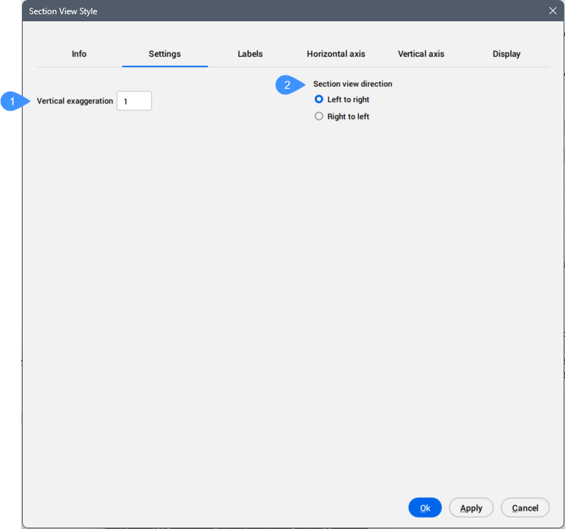
Settings tab
Defines general section view style settings.
- Vertical exaggeration
- Section view direction
- Vertical exaggeration
- Scales the vertical axis in section views by specifying how much elevation values are multiplied to improve the visibility of elevation changes. A value of 1 indicates no vertical exaggeration, while higher values increase the scale, making elevation differences more pronounced in the profile view.
- Section view direction
- Allows you to set the section view direction.
-
- Left to right
- Sets the section view direction from left to right, as if looking from the lowest station to the highest station on the alignment.
- Right to left
- Sets the section view direction from right to left, as if looking from the highest station to the lowest station on the alignment.
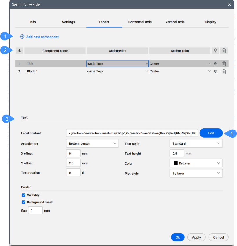
Labels tab
Adds and manages Section View Labels.
- Add new component
- List of components
- Component properties
- Edit component properties
- Add new component
- Adds new Text and Block components that define Section View Style.
- List of components
-
Lists the specified components of the section view style.
- Draw order
- Displays the components on the draw order.
- Component name
- Displays the components names. The list can be sorted alphabetically.
- Anchored to
-
Defines the position (anchoring) dependency between section view style components.
A component can be aligned either relative to the selected edge of the section view frame or relative to another component.
The alignment options include:
- <Axis Top> – aligns the component with the top horizontal edge of the frame.
- <Axis Bottom> – aligns the component with the bottom horizontal edge of the frame.
- <Axis Left> – aligns the component with the left vertical edge of the frame.
- <Axis Right> – aligns the component with the right vertical edge of the frame.
- All other text and block components listed – select one to align the current component to.
- Anchor point
-
Defines the component’s anchor point on the selected edge of the section view frame, or on the dependent component to which it is anchored.
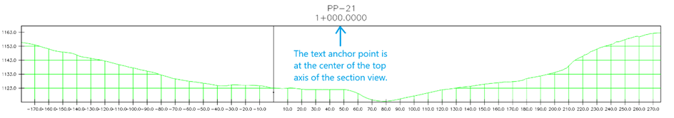
When aligning text component, you can choose where the text will attach. The anchor point defines the exact position on the frame edge or on another component that the text follows.
- Left – attaches the text to the left side of a horizontal edge, the top of a vertical edge, or the left side of a block.
- Center – attaches the text to the middle of the selected edge or block.
- Right – attaches the text to the right side of a horizontal edge, the bottom of a vertical edge, or the right side of a block.
When aligning a block to another component, you can place it on the chosen anchor point of that component.
- Visible
- Toggles the visibility of the component.
- Remove
- Removes the component.
- Components properties
- Displays the properties of the text or block component, which you can edit.
-
- Text
-
- Label contents
-
Displays text content of the section view style. To add, edit or remove attributes displayed in the label, click the Edit button to open the Text Content Editor dialog box.
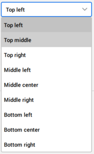
- Attachment
-
Sets the position of text components relative to the selected point. Attachment can be set to Top left, Top middle, Top right, Middle left, Middle center, Middle right, Bottom left, Bottom center or Bottom right.
For example, if you select Top left, the text will be aligned to the upper-left corner.
- X offset
-
Specifies the offset of the text component from the symbol in the X direction.
- Y offset
- Specifies the offset of the text component from the symbol in the Y direction.
- Text rotation
-
Sets the rotation angle of the text component. The default rotation angle is 0.
- Text style
-
Specifies the text style used for the text component.
- Text Height
-
Sets the height of the text components.
- Color
-
Sets the color of the text component.
- Plot style
- Sets the plot style of the text component.
- Border
- Allows you to define the border of the section views.
-
- Visibility
- Toggles the border visibility of the section views.
- Background mask
- Adds a white background.
-
- Block
-
- Block name
-
Allows you to choose a block from the drop-down list of all blocks available in the drawing.
- Block height
- Sets the height of block component in the drawing.
- Color
- Defines color the block component.
- Plot style
- Sets the plot style from the drop-down list of available plot styles.
- Attachment
-
Sets the position of block components relative to the selected point.
Attachment can be set to Top left, Top middle, Top right, Middle left, Middle center, Middle right, Bottom left, Bottom center, Bottom right or Insertion point.
Examples:
- If you select Insertion point, the block is placed using its defined insertion point.
- If you select Top left, the block is placed using its upper-left corner instead of the insertion point.
- X offset
- Specifies the offset of the block component from the insertion point in the X direction.
- Y offset
- Specifies the offset of the block component from the insertion point in the Y direction.
- Rotation
-
Sets the rotation angle of the block component. The default rotation angle is 0.
- Edit component properties
- Opens the Text Content Editor dialog box.
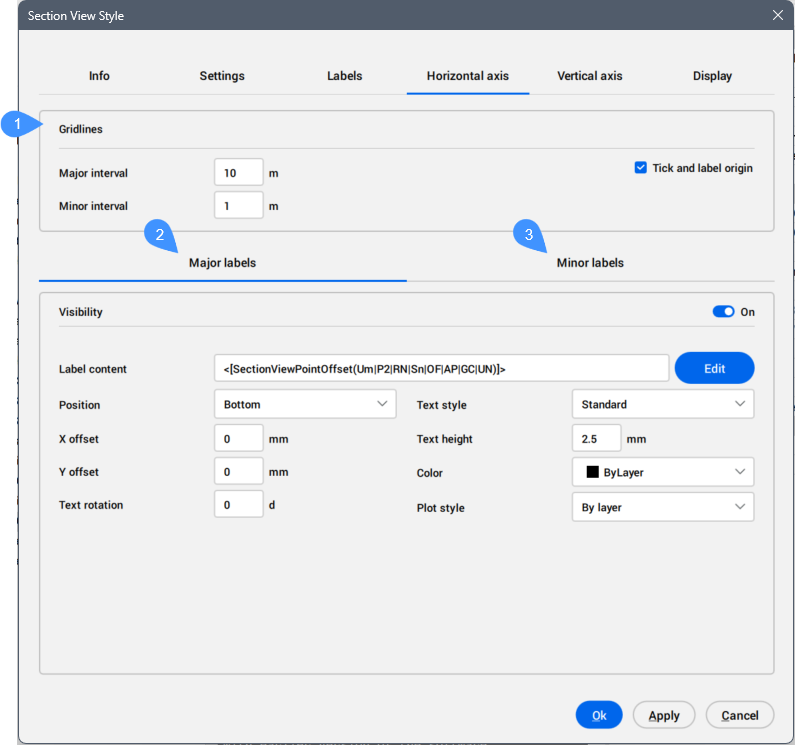
Horizontal axis tab
Manages the horizontal intervals and labels for horizontal gridlines in section views.
- Gridlines
- Major labels
- Minor labels
- Gridlines
- Sets the gridlines.
-
- Major interval
- Sets the major interval for gridlines.
-
- Minor interval
- Sets the minor interval for gridlines.
-
- Tick and label origin
- Enables gridlines and labels on the origin of the section view.
- Major labels
- Defines the labels for the major interval of gridlines.
-
- Visibility
- Allows you to toggle the visibilities of the major labels.
-
- Label content
-
Displays text content of the major label. To add, edit, or remove attributes displayed in the label, click the Edit button to open the Text Content Editor dialog box.
-
- Position
- Allows you to set the position for the major label relative to the gridlines.
-
- X offset
- Sets the offset of the labels from the insertion point in the X direction.
- Y offset
- Sets the offset of the labels from the insertion point in the Y direction.
-
- Text rotation
- Sets the rotation angle of the major label text. The default value is 0.
-
- Text style
- Specifies the text style used for the major label text.
-
- Text height
- Sets the height of the label text.
-
- Color
- Sets the color of the label.
-
- Plot style
- Sets the plot style from the drop-down list of available plot styles.
- Minor labels
- Defines the labels for the minor interval of gridlines.
Vertical axis tab
Manages the vertical intervals and labels for horizontal gridlines in section views.
For a detailed description, see the above Horizontal axis tab section.
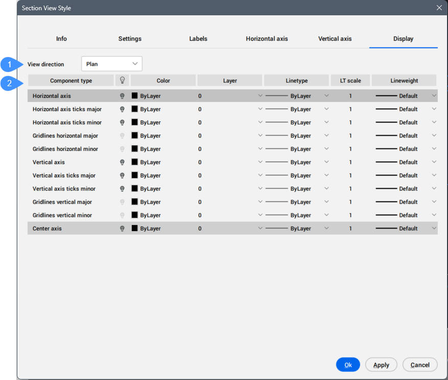
Display tab
Manages the visibility and display characteristics for each component from section views.
- View direction
- List of components
- View direction
- Allows you to set how the components of section views are displayed, depending on the selected view direction.
-
- Plan
- Allows you to specify how the objects are displayed in plan view.
- List of components
- Lists section view style components with assigned visibility and layer.
-
- Component Type
-
Displays the component types.
- Visible
-
Displays the component visibility. Click the light icon to change the visibility.
- Color
-
Displays a color for the component. To change the color, click the field and select a new color in the Color dialog box.
- Layer
-
Displays the layer for components. Choose another one from the drop-down list of available layers.
- Linetype
-
Displays the linetype for the component. Choose another one from the drop-down list or Load... option to open the Load Linetypes dialog box.
- LT scale
- Displays the linetype scale for the component. Click the field to edit.
- Lineweight
-
Displays the lineweight for the component. Choose another one from the drop-down list.