Okno dialogowe Edytor stylów etykiet umożliwia tworzenie stylów etykiet.
Zakładka Informacje
Karta Ogólne
Karta Składniki
Stan przeciągnięcia
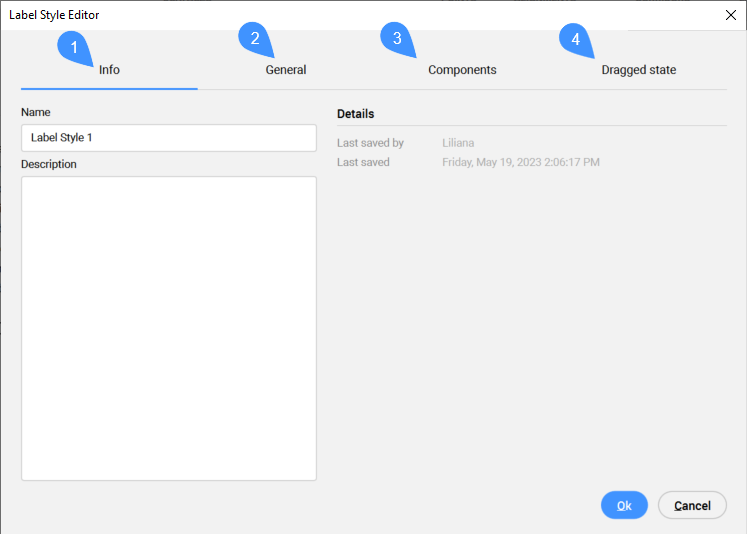
Zakładka Informacje
Wyświetla informacje o stylu etykiety.
Nazwa
Ustawia i wyświetla nazwę stylu etykiety.
Opis
Ustawia i wyświetla opis stylu etykiety.
Detale
Wyświetla Ostatnio zapisane przez i Data ostatniego zapisu.
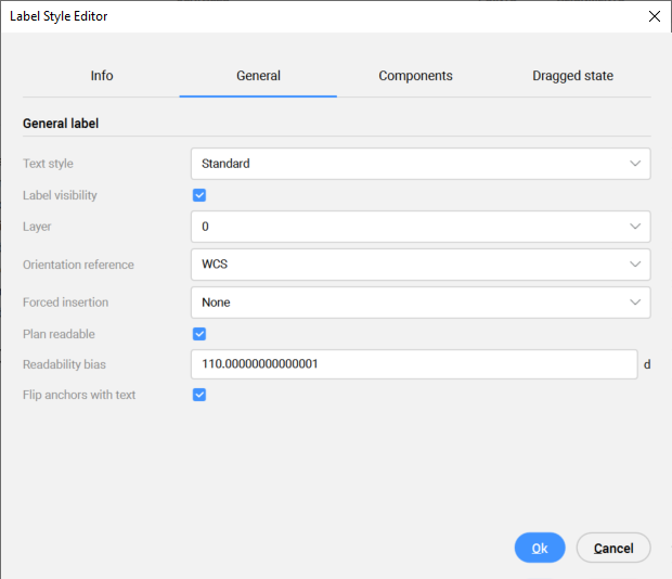
Karta Ogólne
Definiuje ogólne ustawienia etykiety.
Styl tekstu
Ustawia styl tekstu z listy rozwijanej.
Uwaga: Do zarządzania stylami tekstu służy Eksplorator rysunków.
Widoczność etykiety
Przełącza widoczność etykiety na rysunku.
WArstwa
Ustawia warstwę etykiety z listy rozwijanej.
Uwaga: Do zarządzania warstwami służy panel Warstwy.
Odniesienie orientacji
Ustawia odniesienie orientacji etykiet względem powiązanego obiektu, orientacji widoku ekranu lub światowego układu współrzędnych (WCS) z listy rozwijanej.
Wymuszone wstawianie
Określa położenie etykiety względem obiektu:
None: Utrzymuje pozycję etykiety zorientowaną względem obiektu.
Top: Modyfikuje pozycję etykiety tak, aby znajdowała się nad obiektem.
Bottom: Modyfikuje pozycję etykiety, aby znajdowała się poniżej obiektu.
Plan czytelny
Przełącza parametr przerzucania czytelności.
Błąd Czytelności
Ustawia kąt, powyżej którego tekst etykiety punktu jest obracany do czytelnego kąta.
Odwróć kotwice z tekstem
Przełącza odwrócone kotwice z tekstem etykiety.
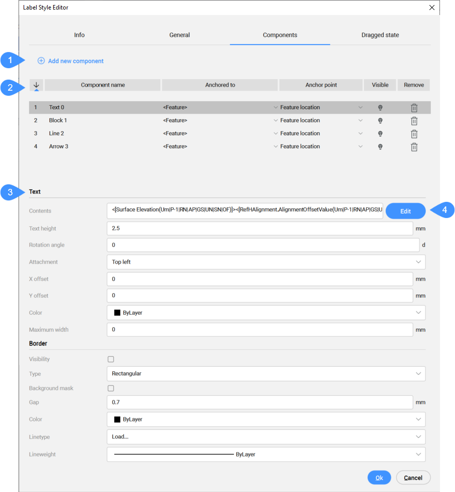
Karta Składniki
Dodaje komponenty stylu etykiety i zarządza nimi.
Dodaj nowy komponent
Lista komponentów
Właściwości komponentu
Edycja
Dodaj nowy komponent
Dodaje nowe komponenty Text, Block, Line i/lub Arrow w celu zdefiniowania stylu etykiety.
Lista komponentów
Wyświetla listę określonych składników stylu etykiety.
Kolejność wyświetlania
Wyświetla komponenty w kolejności losowania. Kolejność rysowania można zmienić, wpisując nowy numer pozycji dla komponentu.
Nazwa komponentu
Wyświetla nazwy komponentów. Listę można sortować alfabetycznie.
Zakotwiczony do
Określa zależność między elementami stylu etykiety.
Punkt zakotwiczenia
Definiuje punkt kontrolny komponentu zależnego, wybierając go z listy rozwijanej.
wiDoczny
Przełącza widoczność komponentu.
Usuń
Usuwa komponent.
Właściwości komponentu
Wyświetla właściwości komponentu, które można edytować.
Właściwości komponentu danych/tekstu
Tekst
Zawartość
Wyświetla zawartość tekstową stylu etykiety. Aby dodać, edytować lub usunąć atrybuty wyświetlane na etykiecie, wybierz opcję Edytuj w celu otwarcia okna dialogowego Edytor zawartości tekstu.
Uwaga: Proces wyświetlania atrybutu zdefiniowanego przez użytkownika na wybranych punktach Civil na rysunku został opisany w artykule Tworzenie atrybutów zdefiniowanych przez użytkownika dla punktów Civil. Możliwe jest również użycie właściwości z innego obiektu (Surface, Horizontal Alignment i Vertical Alignment).
Wysokość Tekstu
Ustawia wysokość elementów danych/tekstu prezentowanych w etykiecie.
Kąt obrotu
Ustawia kąt obrotu elementów danych/tekstu prezentowanych w etykiecie. Domyślny kąt obrotu wynosi 0.
Załącznik
Ustawia pozycję elementów danych/tekstu względem punktu. Załącznik może być ustawiony na Górny lewy, Górny środkowy, Górny prawy, Środkowy lewy, Środkowy środkowy, Środkowy prawy, Dolny lewy, Dolny środkowy lub Dolny prawy.
Uwaga: Ustawienia Środek po lewej oznaczają, że tekst jest umieszczony tak, aby symbol znajdował się pośrodku lewej strony tekstu.
Odsunięcie X
Określa przesunięcie komponentu danych/tekstu od symbolu w kierunku X.
Odsunięcie Y
Określa przesunięcie komponentu danych/tekstu od symbolu w kierunku Y.
Kolor
Ustawia kolor komponentu danych/tekstu.
Maksymalna szerokość
Określa maksymalną szerokość komponentu danych/tekstu. Maksymalna szerokość określa szerokość obramowania (jeśli odstęp jest ustawiony na 0) i może być widoczna podczas korzystania z maski tła.
Granica
WIDoczność
Przełącza widoczność obramowania etykiety.
Typ
Określa kształt obramowania etykiety. Obramowanie można ustawić jako prostokątne, zaokrąglone prostokątne lub okrągłe.
Maska Tła
Dodaje białe tło.
Luka
Określa odstęp między tekstem, a linią obramowania.
Kolor
Określa kolor linii granicznej.
Rodzaj linii
Określa typ linii obramowania.
SzerokośćLinii
Określa grubość linii obramowania.
Właściwości składnika bloku
BLok
Nazwa bloku
Opcja wyboru bloku z listy dostępnych bloków na rysunku.
Wysokość bloku
Ustawia wysokość komponentu bloku na rysunku.
Obrót
Ustawia kąt obrotu komponentu bloku prezentowanego w etykiecie. Domyślny kąt obrotu wynosi 0.
Załącznik
Ustawia punkt dołączenia komponentu blokowego w etykiecie. Załącznik może być ustawiony jako Górny lewy, Górny środkowy, Górny prawy, Środkowy lewy, Środkowy środkowy, Środkowy prawy, Dolny lewy, Dolny środkowy, Dolny prawy lub Punkt wstawiania.
Uwaga: Ustawienia Środek po lewej oznaczają, że tekst jest umieszczony tak, aby symbol znajdował się pośrodku lewej strony tekstu.
Odsunięcie X
Określa przesunięcie komponentu bloku od punktu wstawienia w kierunku X.
Odsunięcie Y
Określa przesunięcie komponentu bloku od punktu wstawienia w kierunku Y.
Kolor
Określa kolor komponentu bloku.
Rodzaj linii
Określa rodzaj linii bloku.
SzerokośćLinii
Określa szerokość linii bloku.
Właściwości komponentu linii
Linia
Użyj kotwicy punktu końcowego
Przełącza połączenie między linią a punktem kontrolnym.
Zakotwicz komponent w punkcie końcowym
Jeśli Użyj kotwicy punktu końcowego jest zaznaczone, możliwe jest wybranie elementu Kotwica punktu końcowego.
Komponent kotwicy to element, względem którego linia jest pozycjonowana. Punktu końcowy komponentu można ustawić na <Funkcja> lub Data. Gdy komponent kotwicy punktu końcowego jest ustawiony na <Funkcja>, linia jest dołączana do punktu mocowania komponentu etykiety. Gdy jest ustawiona na Data, może to być jedna z kilku lokalizacji na komponencie etykiety (zdefiniowana w punkcie kontrolnym punktu końcowego).
Punkt zakotwiczenia punktu końcowego
Punkt zakotwiczenia punktu końcowego można zdefiniować tylko wtedy, gdy komponent zakotwiczenia punktu końcowego jest ustawiony na Dane. Punkt końcowy może być ustawiony jako Lewy górny, Środkowy górny, Prawy górny, Lewy środkowy, Prawy środkowy, Lewy dolny, Środkowy dolny lub Prawy dolny.
Typ długości
Typ długości linii można ustawić na stałą długość (zdefiniowaną w opcji Stała długość) lub wartość procentową (zdefiniowaną w opcji Długość procentowa).
Stała długość
Gdy typ długości jest ustawiony na Stała długość, można zdefiniować całkowitą długość linii.
Procent długości
Gdy typ długość jest ustawiony na Długość procentowa, można zdefiniować całkowitą długość linii.
Kąt obrotu
Gdy opcja Użyj kotwicy punktu końcowego nie jest zaznaczona, można ustawić kąt obrotu elementu linii. Domyślny kąt obrotu wynosi 0.
Odsunięcie X punktu początkowego
Określa przesunięcie punktu początkowego linii w kierunku X.
Odsunięcie Y punktu początkowego
Określa przesunięcie punktu początkowego linii w kierunku Y.
Odsunięcie X punktu końcowego
Gdy opcja Użyj kotwicy punktu końcowego jest zaznaczona, można zdefiniować przesunięcie punktu końcowego linii. Przesunięcie punktu końcowego X określa przesunięcie punktu końcowego linii w kierunku X.
Odsunięcie Y punktu końcowego
Gdy opcja Użyj kotwicy punktu końcowego jest zaznaczona, można zdefiniować przesunięcie punktu końcowego linii. Przesunięcie punktu końcowego Y określa przesunięcie punktu końcowego linii w kierunku Y.
Kolor
Określa kolor komponentu linii.
Rodzaj linii
Określa rodzaj linii.
SzerokośćLinii
Określa szerokość linii.
Właściwości komponentu strzałki
Strzałka
Styl grotu strzałki
Określa styl główki strzałki z listy opcji.
Rozmiar grotu strzałki
Określa rozmiar główki strzałki.
Obrót
Ustawia kąt obrotu komponentu bloku prezentowanego w etykiecie. Domyślny kąt obrotu wynosi 0.
Stała długość
Przełącza opcję ustawienia stałej długości strzałki.
Długość
Określa długość strzałki.
Odsunięcie X
Określa przesunięcie punktu środkowego strzałki od symbolu w kierunku x.
Odsunięcie Y
Określa przesunięcie komponentu danych/tekstu od symbolu w kierunku Y.
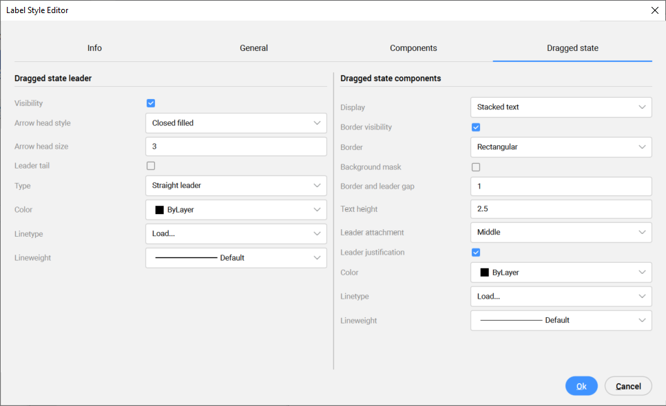
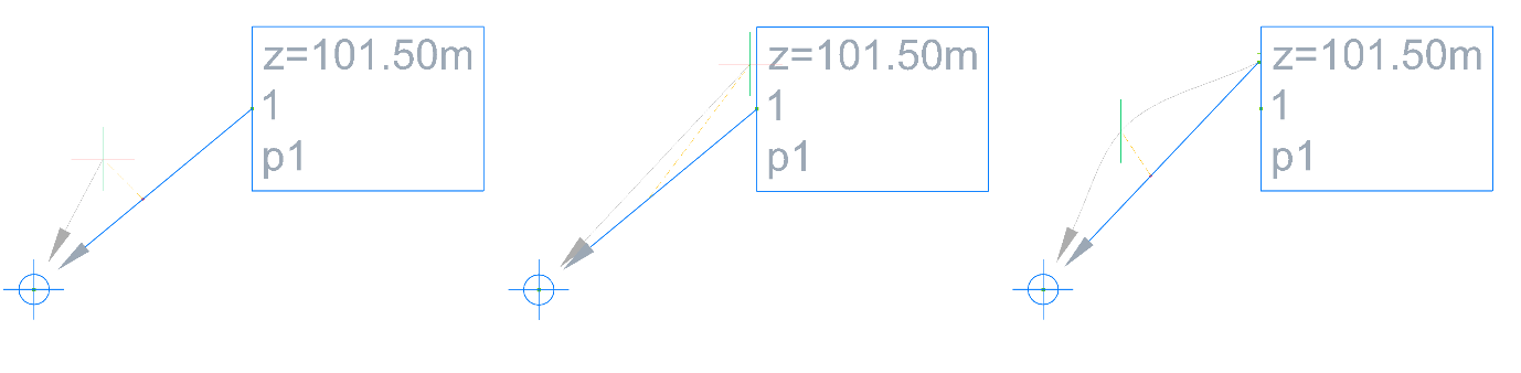
Definiuje styl lidera i styl komponentów w przeciągniętym stanie.
Odnośnik stanu przeciągnięcia
Wyświetla właściwości stylu lidera w stanie przeciągniętym, które można edytować.
WIDoczność
Przełącza widoczność etykiety na rysunku.
Styl grotu strzałki
Definiuje styl zakończenia strzałki, wybierając go z listy rozwijanej.
Rozmiar grotu strzałki
Określa rozmiar główki strzałki.
Ogon odnośnika
Przełącza ogon lidera na rysunku.
Uwaga: Gdy ogon odnośnika jest włączony, jego długość jest równa rozmiarowi grotu strzały.
Typ
Ustawia typ prowadnicy jako linię prostą lub splajn. Aby edytować krzywą splajnu, przeciągnij znak "+" ze środka prowadnicy do żądanej pozycji.
Uwaga: Zaznaczenie i przeciągnięcie sekcji '+' odnośnika spowoduje utworzenie krzywych, natomiast zaznaczenie '-' spowoduje usunięcie sekcji krzywej splajnu.
Kolor
Określa kolor lidera w stanie przeciągniętym.
Rodzaj linii
Definiuje typ linii lidera w przeciągniętym stanie.
SzerokośćLinii
Definiuje wagę liniową lidera w przeciągniętym stanie.
Komponenty stanu przeciągnięcia
Wyświetla styl właściwości komponentów w stanie przeciągniętym, który można edytować.
Ekran
Wyświetla komponenty w stanie przeciągniętym jako:
Ułożony tekst: oznacza, że ich styl zostanie zdefiniowany w zakładce Stan przeciągnięcia.
Jak skomponowano: oznacza, że styl jest taki sam, jak zdefiniowany w zakładce Komponenty, w oknie dialogowym Edytor zawartości tekstu .
Uwaga: Jeśli chcesz, aby styl etykiety był inny w stanie przeciągniętym, wybierz Wyświetl opcję Tekst ułożony i zdefiniuj pozostałe jej właściwości.
Widoczność granic
Przełącza widoczność obramowania w stanie przeciągniętym.
Granica
Definiuje kształt obramowania w stanie przeciągniętym jako: prostokątny, zaokrąglony prostokątny lub okrągły.
Maska Tła
Przełącza maskę tła komponentów w stanie przeciągniętym.
Luka w granicy i odnośniku
Definiuje granicę i lukę lidera w przeciągniętym stanie.
Wysokość tekstu
Określa wysokość tekstu w stanie przeciągniętym.
Przywiązanie odnośnika
Określa pozycję punktu zaczepienia lidera, wybranego z listy rozwijanej.
Justowanie odnośnika
Przełącza uzasadnienie lidera. Komponenty tekstowe zmieniają swoje uzasadnienie wraz z ruchem lidera.
Kolor
Określa kolor komponentów w stanie przeciągniętym.
Rodzaj linii
Definiuje rodzaj linii obramowania komponentów w stanie przeciągniętym.
SzerokośćLinii
Definiuje grubość linii obramowania komponentów w stanie przeciągniętym.
Uwaga: Wszystkie zmiany są dynamicznie wyświetlane na rysunku.